My Interactive Journey

Critique of a Website
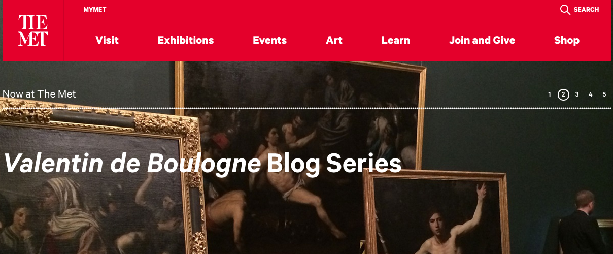
In terms of hierarchy, this website allows the eye to fall on easily to the most important features, the tabs at the top. This allows the user to find pages directly. The imagery is very attractive as the artwork is very beautiful. The artwork is relevant to the website’s purpose. Usability works here as well, where the links are easy to find and information is concise. There’s obvious designated places for people to locate the links they need to. Color is effective here because the red stands out against the rest of the website colors. There’s not an overload of color, just a spot color and the beauty of art work to fill in the rest of the space. The website succeeds at making it easily navigable, with its bright spot color. There is also a good eye buffer as there’s not an over clutter of words where the user might feel flooded. The artwork in large size is attractive and directs the web user to the latest on the site. The website has somewhat of a boring grid pattern; everything is divided in columns of two, very rigidly and the text is all left aligned. I think a more creative pattern could be more useful here. Lastly, I think the bold white text on the red is hard to read. It would be better in a thinner san serif font.