My Interactive Journey
Responsive Website
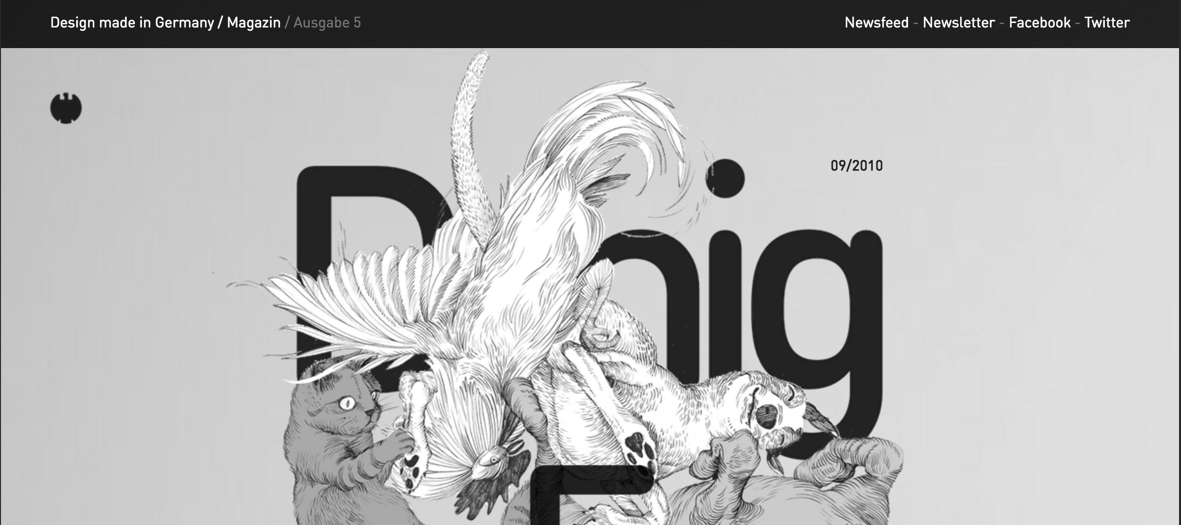
In this blog I am critiquing a responsive website. This website works well by means of both computer and tablet. The tablet view works even better for this website as it is vertical. The vertical orientation compliments this site due to the vertical orientation of the photo of focus on the site. The columns are legible and presents a consistency in the visual aesthetic of the website.
Speaking of the visual aesthetic of the website, the monochromatic color scheme is very strong in this. The opacities and the layouts make this site interesting and makes me want to explore it.
I will address the phone screen view as problematic for this website. For example, the picture in the background gets cut off and starts to repeat on the right. The text area looks decent and readable on the Galaxy S5, but on the iPhone 5, there is this odd block border on the right and the picture even disappears down below.
I would say that the typography and overall design of this website is very strong. However, they did not make a design that was adaptable to the mobile platform. Much of the design gets lost and chopped up, especially regarding the background and leaves it confusing to navigate for the user.