large arrow

Typography

These pieces of typography study came from a class I took in college exculively focused on the art and practice of typography. There I studied the close up detail of the letterform, using them to make artistic displays, practiced interesting word layouts and eventually recreated an existing poster solely with type.

Type Poster Design

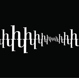
This piece is an alternative poster for a concert that Twenty-One Pilots was hosting. I decided to make the most important piece of information, the piece of info that the directed audience would be the most excited about, and enlarged it. I then played around with masks and made a texture pattern with randomly arranged V's in comic sans. It gave the larger letterforms an interesting texture and graphic element. I then put the rest of the important info at the bottom.

This design reminds me how some posters were made in the psychadelic era of design. They share the feature of the information serving as a graphic texture and quality, however I think mine is considerably more legible.

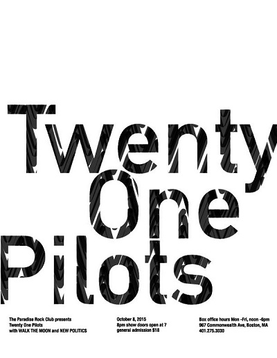
Alternative poster with just type(1)

Typographic art forms

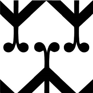
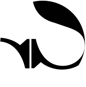
These are exercises in which we used the letterform to make abstract artistic statements.They were assignments in which we looked closely or arranged them as a group to make them harmonious. Through these exercises I learned alot about appreciating the time and effort that goes into designing letterforms of typography.

Typographic artwork Typographic artwork

Type arrangement

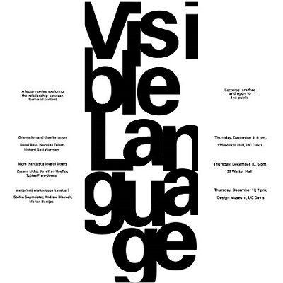
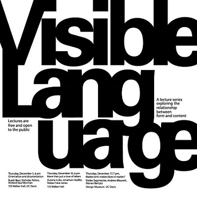
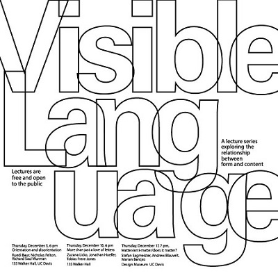
These are exercises where we took example information and had to arrange it with multiple variables of typographic features. In this exercise we practiced the use of space and grids. I went with a more experiemental approach, especially with the title. Similar to my alternative poster, I arranged the most important information as a graphic element that helps make the piece stronger as a whole.

Concept type poster
Concept type poster Concept type poster