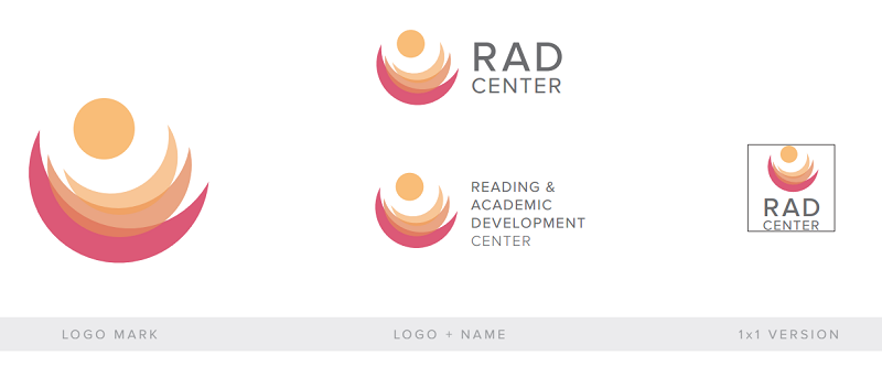
R.A.D. Logo Design
A small group in my group study was assigned to make a new logo for the on-campus Reading and Academic Development Center (R.A.D.). The R.A.D. center both practices research on kids and young adults who struggle with reading and learning skills, as well as provide training and rehabilitation services to improve their reading skills. They asked us to create a logo that would be representative of their facility. My groupmates all came up with our own ideas for the logo for the R.A.D. Center, but this one was my contribution. My group leader, Jessica Lam, had us make an empathy map, in which we would think of words that would best describe the things people at the Center, parent, child or researcher, would feel, say, do and think. For this logo, I made warm and welcoming to both child and parent, I decided to create this progressive and transformative look to the abstract forms, and even though the client did not want to be literal and have a book, she said that my logo looked like flipping pages, and she liked that. All in all, I think my logo has the voice that exemplifies the goals and qualities of the R.A.D. Center. And in the end, it was the one they found suited their needs best.